I have worked for Pluramed Pharmaceutical Ltd. a few years ago and now it gained an international reconition by Designrush. I am really happy about having my work mentioned on their page.
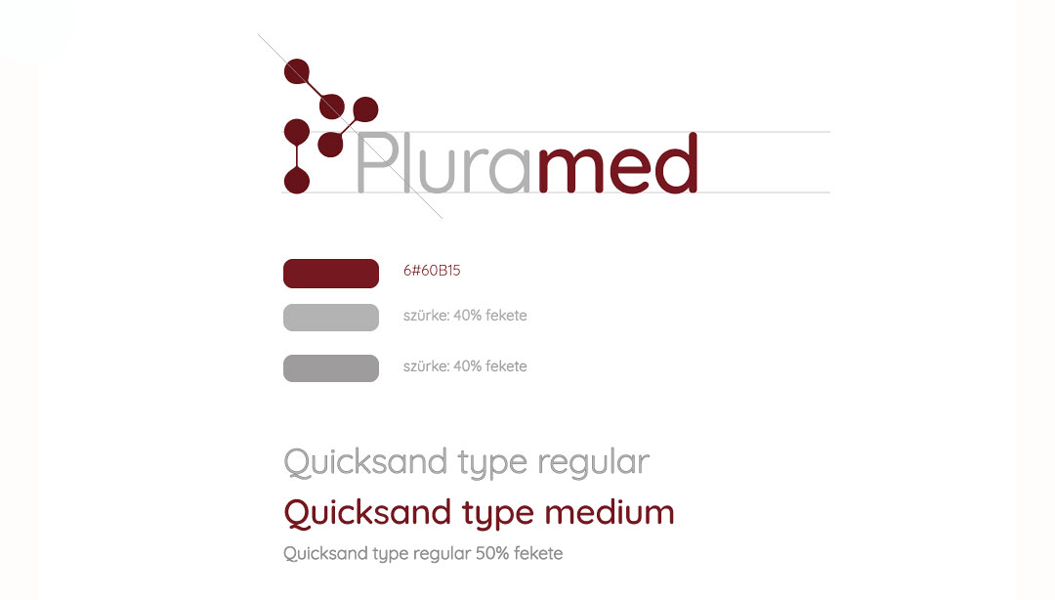
I wanted to create a logo different from the competitive companies. In this field the logos are usually green or blue, and I was looking for a colour combination which is still elegant, gives a business look and science but different from the others. Just imagine a conference where all logos appear on a poster or banner and all has the same color!
I had to be careful, since yellow in this field can rather mean poison. So I chose dark red combined with some grey to calm it down.
The shape of P is built of molecules and also written with letter too for easy legibility.
Here you can find the articel of DesignRush:
https://www.designrush.com/best-designs/logo/pluramed-logo-design
